|
This is a super exciting day for us at Letiman Games as we are announcing a brand new logo design! Although we have always loved our previous logo we wanted to update it to better reflect our company and the direction we are moving in. Why the logo change? When we first started in the industry (5 years ago), Dan had a friend create the original logo. The conversation basically went like this, “I would like a shield, green in color, I am originally from Boston, so maybe throw the Boston skyline in there, and it is a game company, so maybe a die or a meeple.” Thus, the original Letiman Games logo was born. Although the skyline had meaning to us, the meeple was somewhat unnecessary (as games is in the company name) and the image really did not do a lot to stand out or be memorable. 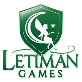 Our company is continuously growing and expanding its influence in the board game industry, and with our growth we wanted to adopt a new logo that has a level of professionalism that reflects our company, our games, and our mission. You will notice that we still retained the green shield aesthetic for consistency and brand recognition but we now have a more polished look with a whimsical and fantastical theme that really reflects the wonder we want to instill in players when they play our games. We strive hard to build new worlds and to tell new stories and we hope that you agree, this logo really does a far better job reflecting our company, our games, and our mission!
3 Comments
|
AuthorFind out the latest news on Letiman Games here! For more day to day posts, follow us on twitter and facebook! Archives
October 2021
Categories |
 RSS Feed
|
© 2013-2021 Letiman Games, LLC.
All Rights Reserved |
|
Connect with Us on Social Media!
|